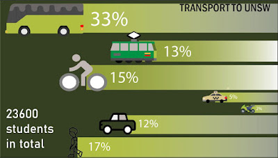
My chosen infographic section was 'transport' - below is the section I made.
Brief explanation:
- Infographic is showing methods of transport to UNSW and how many people go by each transport type (i.e. bus, light rail, etc.)
- The longer the line and the bigger the image; the more people are travelling by that mode of transport (e.g. bus has the biggest image and line - has the most people travelling by it)
The lines are supposed to also represent the path/road to UNSW - all vehicles are travelling to the university. In the centre, my group member and I have put an image of the university (SEE ABOVE POST). Hence, this section leaning from the most right means the journey is starting from the right but is travelling to the centre (the university).

No comments:
Post a Comment